Visual Brand Design
Style Guide
Collateral Design
Iconography
Print Advertising
Digital Advertising
Product Identity Design
Event Design
Visual Brand Design
Style Guide
Collateral Design
Iconography
Print Advertising
Digital Advertising
Product Identity Design
Event Design
ARxIUM is a pharmacy automation and workflow solutions company. Their competitive market advantage is in the versatility they use to solve customer problems. From the ground up, they can build entire systems or work within an existing setup to provide a more modular solution.
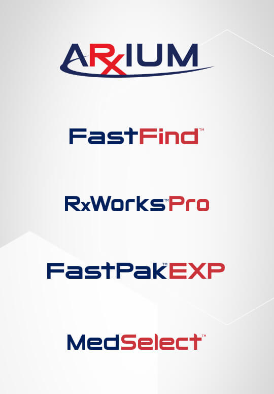
ARxIUM’s current visual brand lacked consistency and felt generic. To address this, the team and I developed a new visual system to promote a consistent and sophisticated look that brings versatility to the forefront. We executed the visual brand across all their marketing and advertising initiatives, redesigned the product logos, event spaces, and signage, and created a Style Guide and an icon library.


